Ab Rogers shares 25 projects at the School of Design

In Summary
- Rogers spoke about his formidable portfolio of projects.
- A studio renowned for projects that are rich with vibrant colour and energy
- The Ab Rogers team favour a hands-on approach
London-based designer, Ab Rogers shared his motivations, manifestos and colour-rich designs at the School of Design in March. Mr Rogers spoke about his formidable portfolio of projects. His ‘25 Projects in 25 Years 1994-2019’ lecture shows how his unique imagination and creative energy has created enduring spaces and experiences, cherished by clients and the people who inhabit and use them.
In 2004, Mr Rogers founded Ab Rogers Design, a studio renowned for projects that are rich with vibrant colour and energy. A former cabinet maker, Mr Rogers has a masters degree from the Royal College of Art (RCA) in London. He was Head of Interior Design at RCA from May 2012 to June 2014, where he established a new interior design course.
Ab Rogers Design is a strategically small practice in London and Melbourne, both close-knit studios of multidisciplinary designers spanning graphic, industrial and interior design and architecture. Ab Rogers and his team favour a hands-on approach, working closely with artists, makers and curators.
They use hand sketching and watercolours to illustrate ideas, with sketch models and clay modelling; favouring pencil, paint and paper over digital tools where appropriate.
“We work with watercolours because they are a fast, instinctive and an easy way to visualise,” says Mr Rogers.
“There is an immediacy and fluency to hand sketches that allows a design to evolve as you draw. You learn so much from sketching with a soft pencil and using materials like clay or card that give you the chance to study forms; to get a feel for certain shapes and play with ideas. While efficient, the computer can encourage you to over edit and get lost in details producing too many options,” he explains.
Mr Rogers believes in a less material, more environmentally sustainable world, and the way to achieve this is by “designing more and making less.” He’s inspired by the vivid colours of natural things – from fruit and vegetables to underwater creatures. His portfolio includes kinetic interventions in exhibitions and retail spaces, immersive installations and responsive spaces.
Mr Rogers loves the colour red. It features in much of his work. “Red is passionate and positive. The colour of vibrancy and enlightenment. Red is fire, it’s the sun – powerful, life giving and full of energy,” he says.
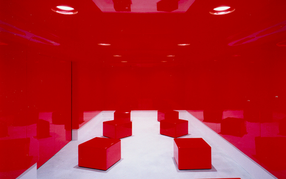
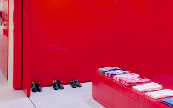
‘Alien wave’ interior space by Ab Rogers Design for Comme des Garcons, photography by Todd Eberle
In 2001 he designed Comme des Garcon’s Flagship store in Paris with Shona Kitchen. The design approach was inspired by the notion that ‘an alien wave’ had swept into the interior. Ms Kitchen and Mr Rogers created a glossy red space covering the horizontal and vertical planes in the space.
Ab Rogers Design recently completed a project for Pattaya’s Wonderfruit Festival in Thailand. A carbon-neutral celebration of the arts, it was the perfect place to experiment with sustainable structures and the qualities of bamboo, combined with water and the vibrant colours of nature.
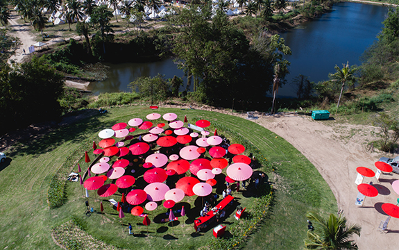
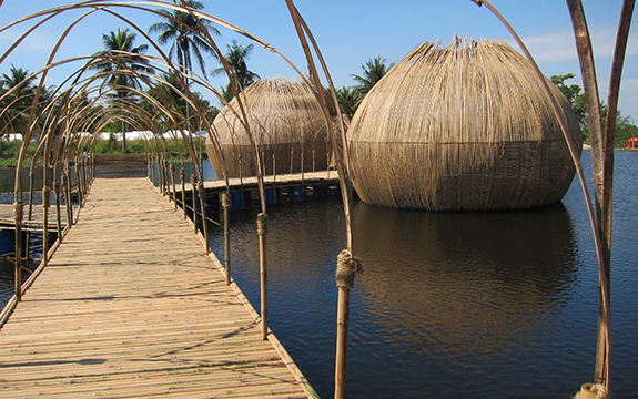
Aerial view of Wonderfruit Festival, sustainable structures and performance installation and design, images supplied by Ab Rogers Design and Wonderfruit
“We had an amazing client for this project. Amazing clients produce amazing work,” Mr Rogers says. The brief was to master plan the festival and create a collection of super-sustainable, permanent structures made from impermanent materials.