
Design
Define the spaces we live in, the products we purchase, and the online and real-life worlds we explore. Bottle your imagination and creativity and pour it into a career in design.
Why study Design with us?
Top 50 in the world for art and design*
Free access to Adobe Creative Cloud#
5-star rating for UG overall experience^
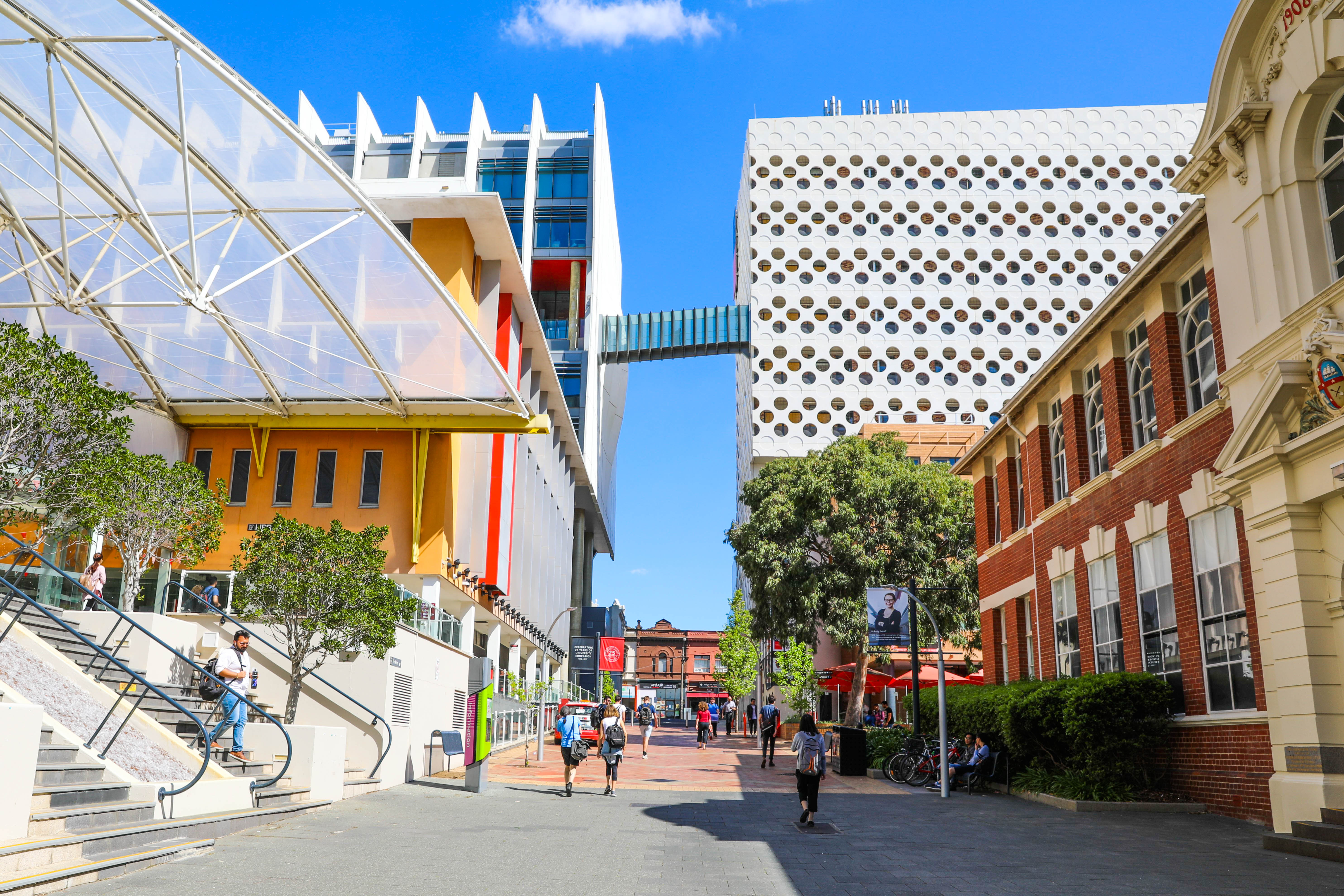
Choose Design at Swinburne
Good design is beyond aesthetics. It can change the world. Our courses cover different design disciplines to give aspiring designers a wide range of career options.
Browse Swinburne’s design courses to find detailed course information, application dates, fees, entry requirements, course subjects, ATAR calculator and more.

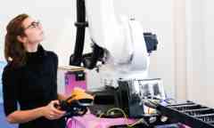
Student experience
Discover Ethan and Katie's Swinburne adventure, which took them to Stanford University, California as part of their honours year at Design Factory Melbourne.
Design study guide
Design study guide
-
QUALITY EDUCATION
World renowned for Design
QS RANKS SWINBURNE IN GLOBAL TOP 50
Swinburne continues to be recognised as having one of the best design schools in the world by the 2018 QS World University Rankings by Subject. Ranked at equal number 40 for Art and Design, Swinburne has improved by more than 10 places since 2017. Swinburne’s ongoing success stems from initiatives such as The Design Factory Melbourne, in partnership with the Global Design Network.
*2020 QS World University Rankings by Subject
#First uni in Australia where students get free access to Adobe Creative Cloud and over 20 different apps
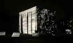
-
- Design
- Sustainability
New research into soil used for building
Dr Gergana Rusenova commences an Australia-Germany research project into textile-reinforced granular materials that are more sustainable and efficient.
Tuesday 30 March 2021 -
- Design
Photomedia graduates capture their lockdown experiences
Bachelor of Design graduates who majored in photomedia captured their lived experiences of COVID-19 lockdown in a rich collection of images, film, sound, projection and installation art.
Friday 14 May 2021

